.png&w=384&q=100)
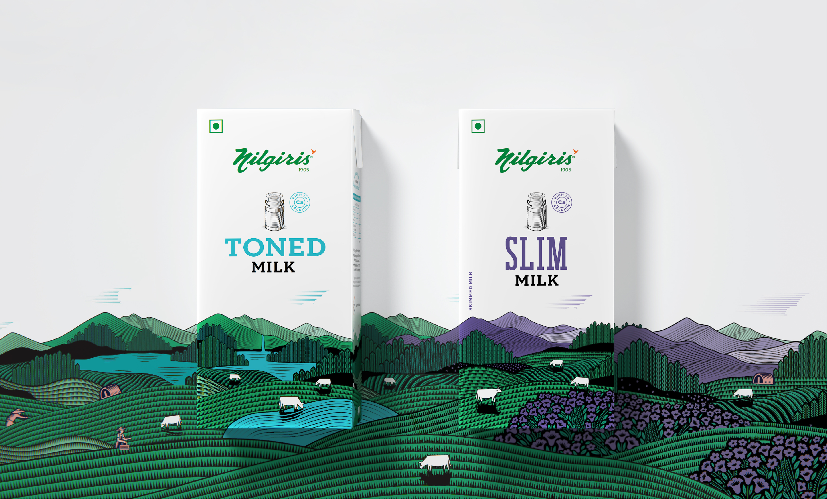
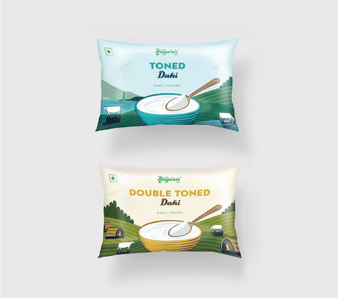
We started with the high-quality dairy range packaging.
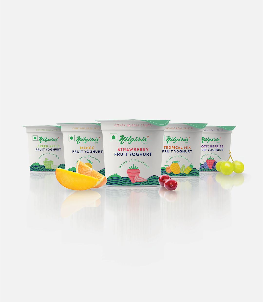
To bring alive the ‘Made of Nilgiris’ promise, we turned the packaging into a collage of bountiful nature landscape. Inspired by a vintage illustration style, the packaging used a visual language that helped place Nilgiris as a modern authentic brand.
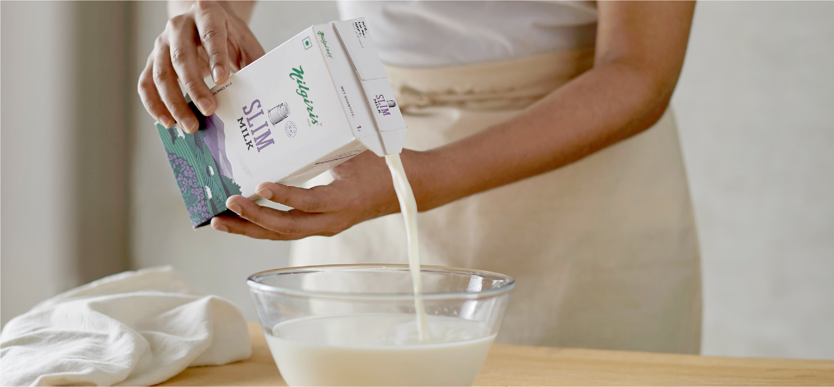
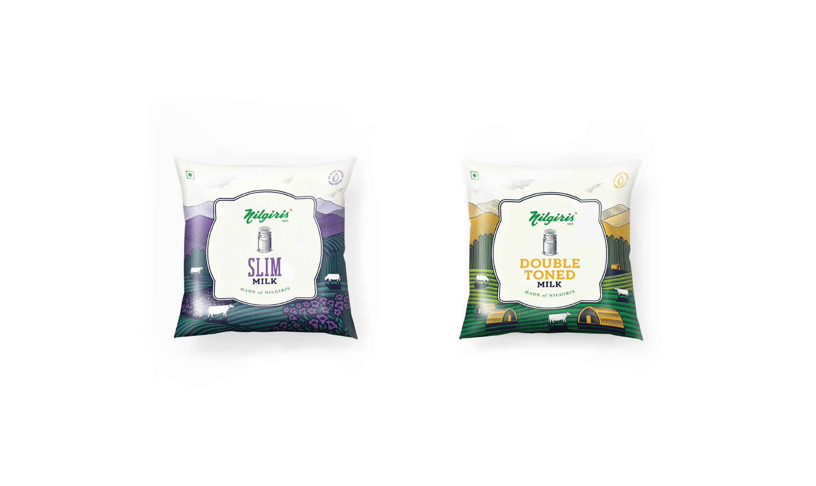
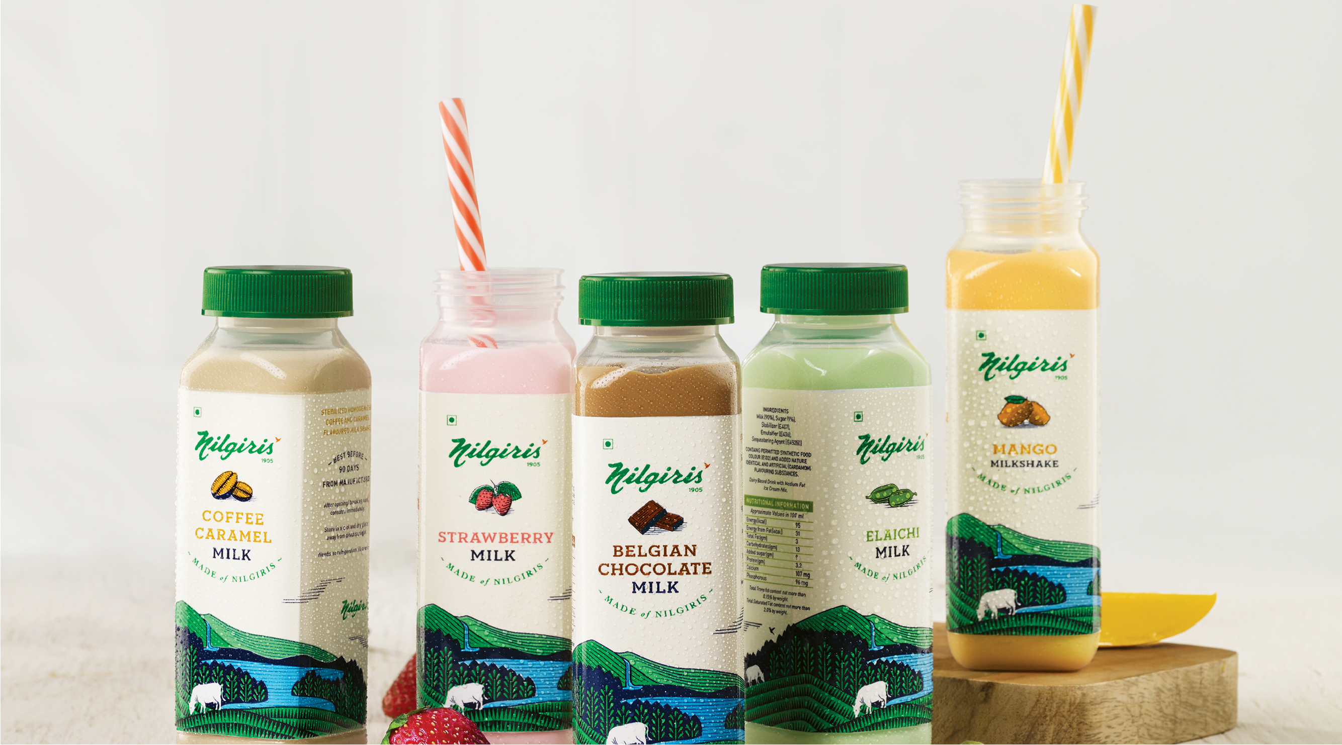
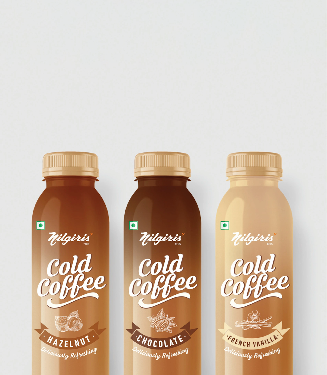
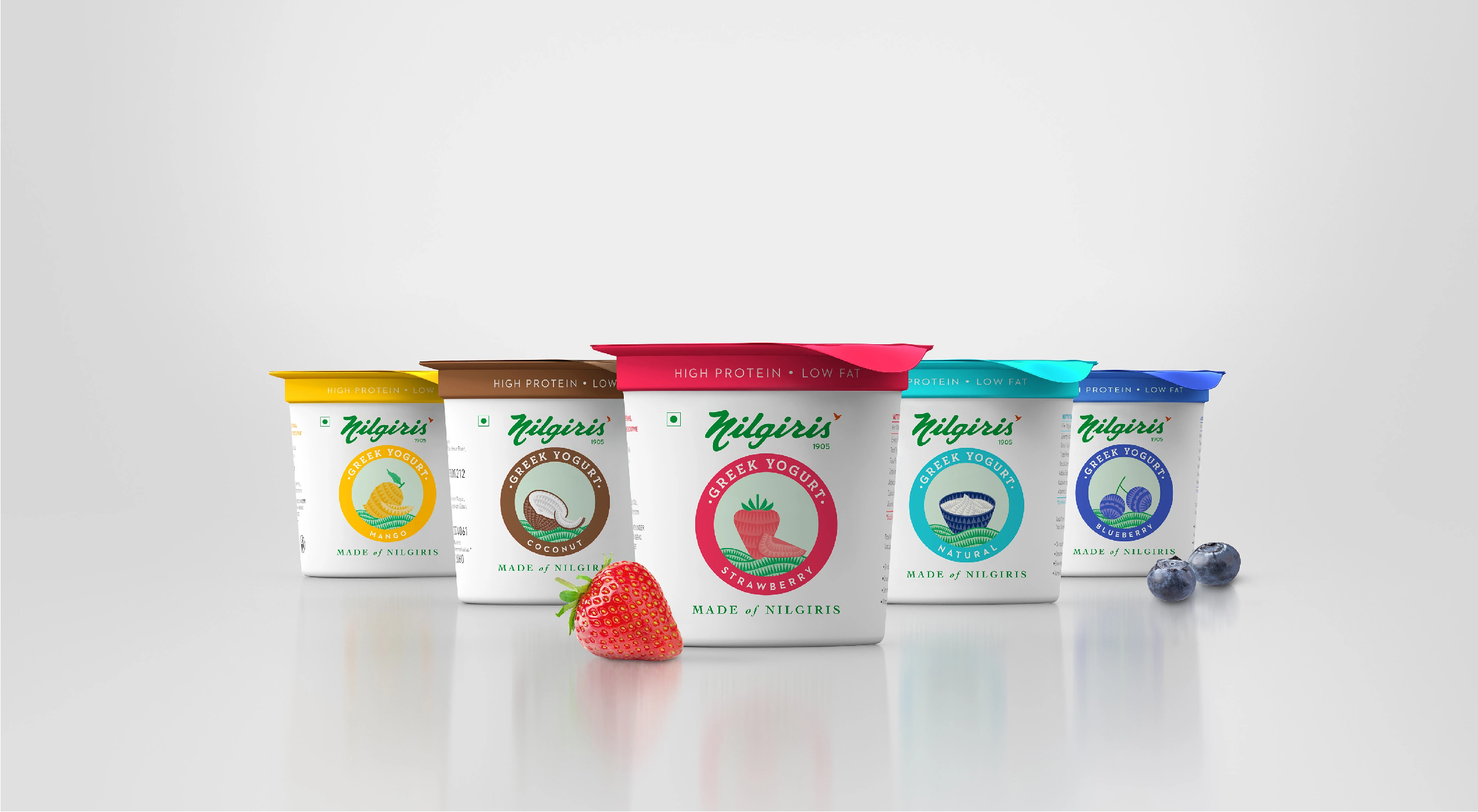
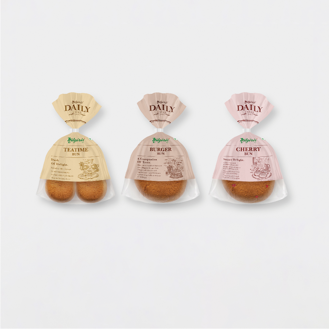
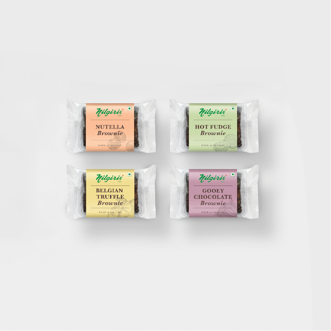
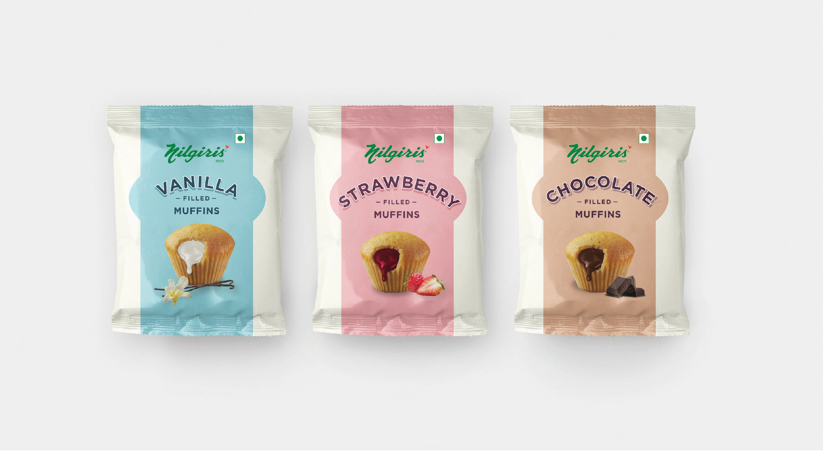
The language was then taken across different categories, adding enough play and variance to create an exciting range.
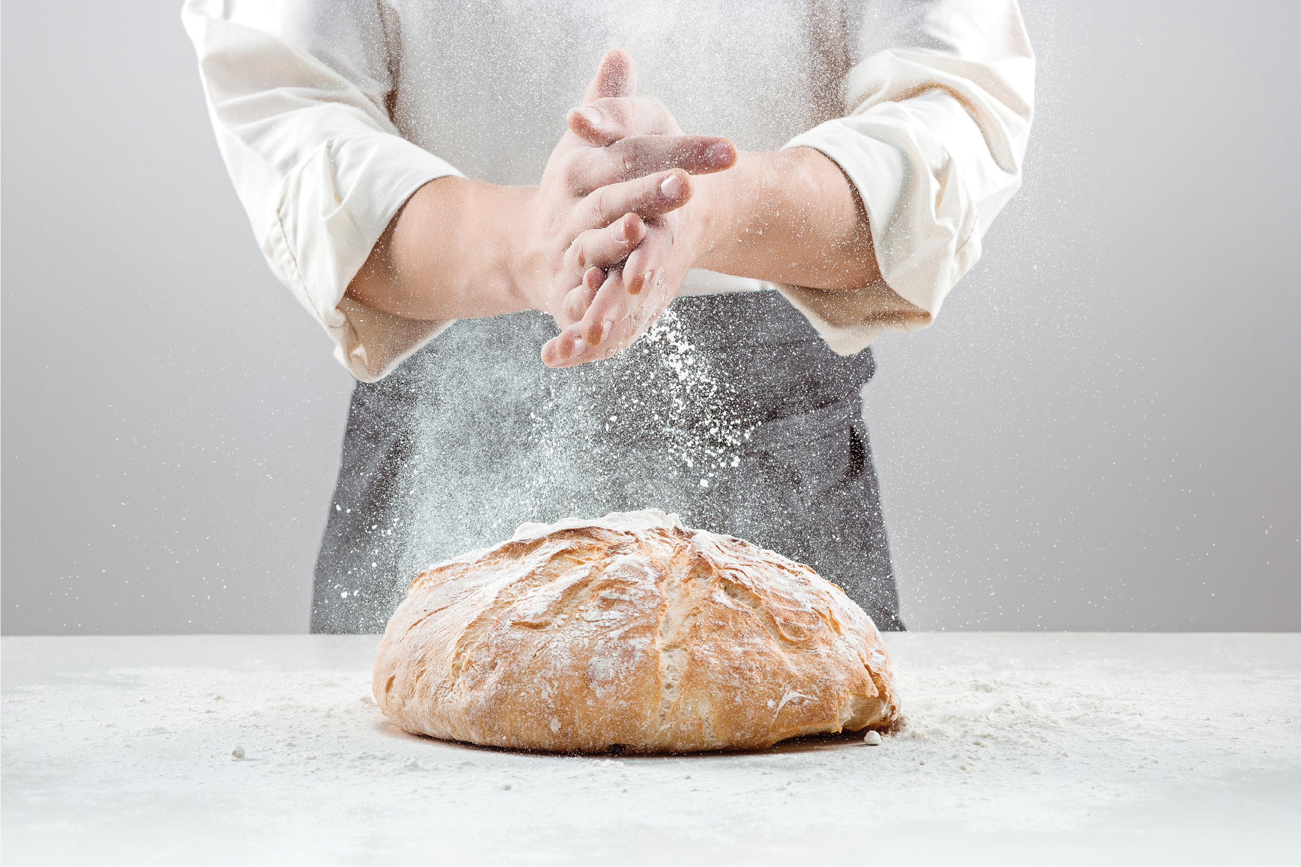
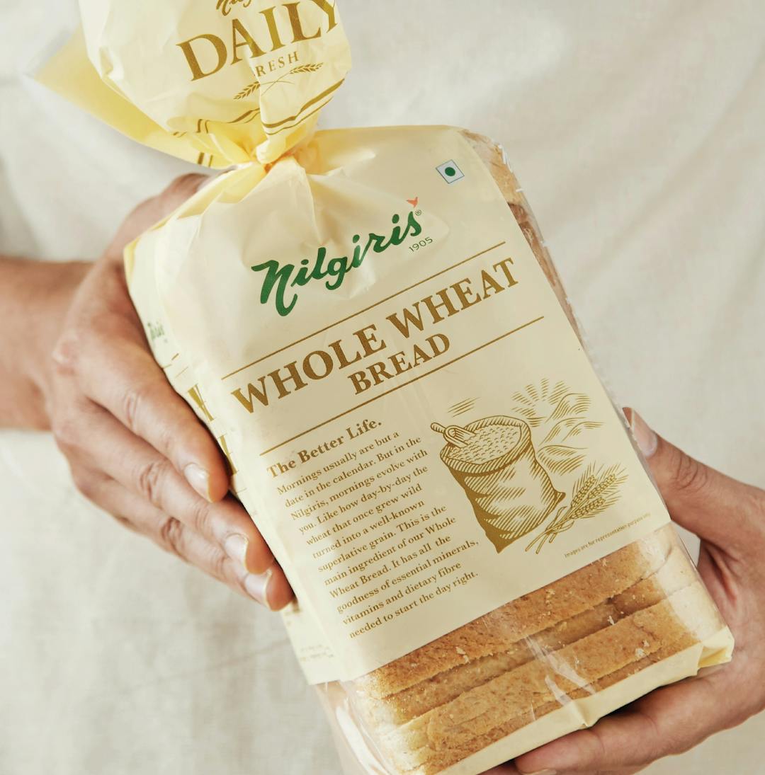
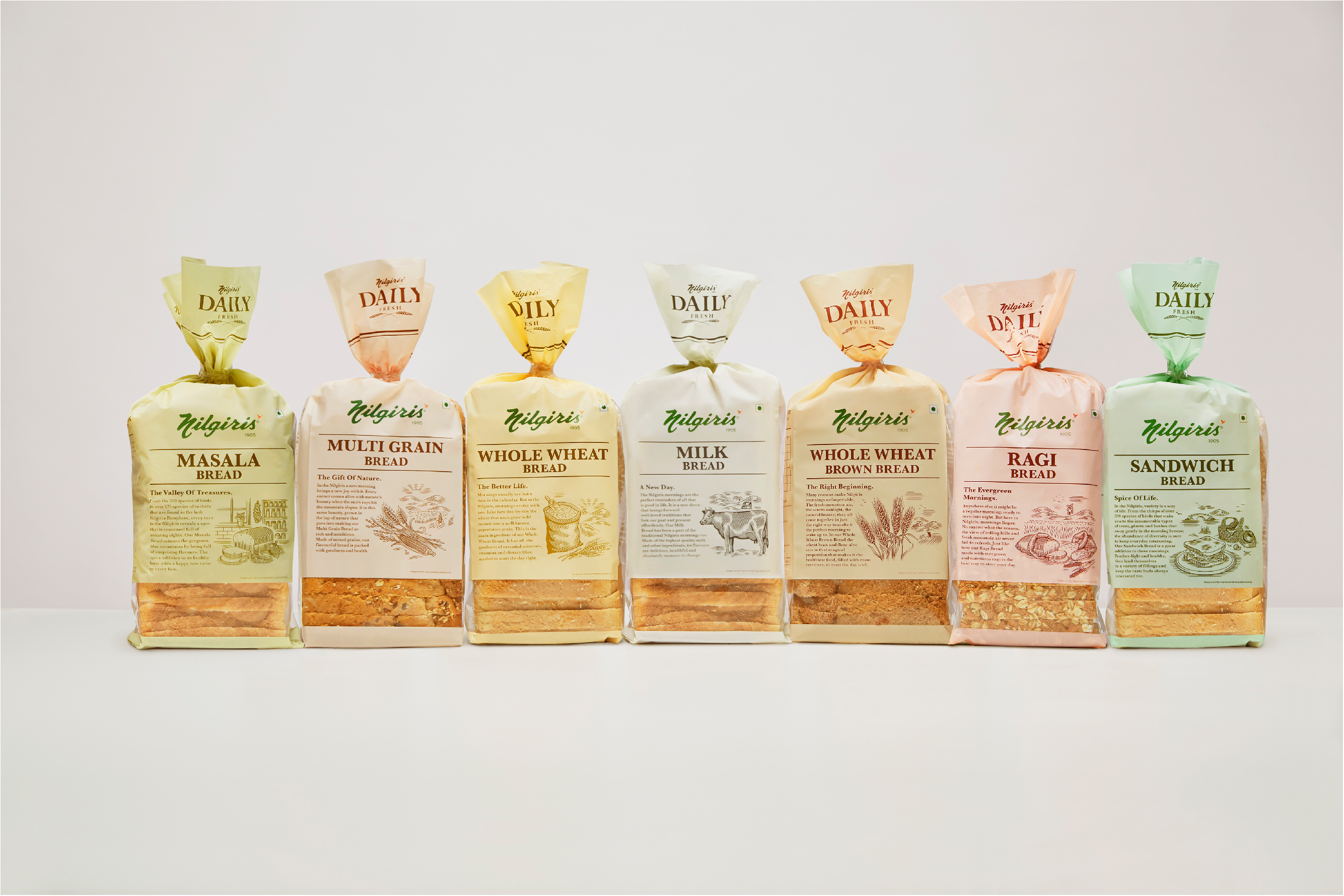
When it came to the bakery packaging design, we tapped into the nostalgia of fresh, warm bread wrapped in newspapers.
Every pack gave a glimpse of the mornings in Nilgiris and the process of baking that helped create the signature Nilgiris fresh loaf.
Accolades
2019
ABBY AWARDS
Silver
Best Integrated Design
2018
ABBY AWARDS
Silver
Packaging
2019
ABBY AWARDS
Bronze
Design Craft/Writing

2018
KYOORIUS IN BOOK WINNERS
Writing for Packaging Design
2018
KYOORIUS IN BOOK WINNERS
Branding / Visual Identity Schemes
2018
KYOORIUS IN BOOK WINNERS
Consumer Packaging Design